EcoWeeb.
-
Lead UX/UI designer, designing an accessible and comprehensive eco-conscious blog space.
-
Discovery and requirements gathering
User research: Conducting interviews and usability studies
Competitor analysis
Wire-framing: Paper and Digital
High-fidelity wire-framing
Accounting for accessibility
Usability testing and validation/project info
-
November 2021- January 2022
-
Figma, Adobe XD, Photoshop, Illustrator

Creating an understanding
-
The User
The user will typically be someone who is interested in learning more about sustainability and what is going on in the environmental community. The main reason for visiting the site will be to consume the content written by Ecoweeb concerning solutions, problems and inspiring content that further promotes an eco-lifestyle.

-
The Brand
EcoWeeb is an environmental consciousness blog, created with the goal to educate and spread awareness of environmental issues, ‘discussing uncomfortable subjects’ and solutions. The mission is to create a space that flows in navigation and maintains the readers attention, increasing interaction.
As this is a blog, the writers main focus is presenting the articles in an aesthetic manner, ensuring the content is easy to discover and digest. The consumers should also be able to actively interact with the content and be able to like, comment and share the articles at will.

Project Pain Points
-
Segregating Sections
As the blog is centred around environmentalism, there are many different facets of the topic that is covered in the blog. From problems, solutions and inspiring content, it wouldn’t make sense to have them all bunched in the same place. It would be ideal to have a break down of categories so that the consumer can easily find and select what type of content they are looking to read.
-
Not just another blog
Ensuring that the consumer can directly link the content and style to the brand is important. The brand needs to make a lasting impression and aims to become a go to brand name in the environmental consciousness community.
Therefore, having a mission statement, colour scheme and branding will go a long way to ensure this goal is met.
-
Flow
The website itself should flow well, allowing the user to seamlessly experience the content problem free. There should be seamless selection options and navigations that predict the users next move. This helps enhance the user experience as there is an ease, or how I like to call it a ‘flow’ to the interaction.
Research
Determined to ensure that the blog had fantastic user flow, I conducted four rounds of user testing which highlighted the importance of quick accessibility to the content the user is looking for.
In the new digital age, where attention spans have decreased due to the fast paced content nature of tik-tok and instagram reels, it is vital to create a space where the user can reach their desired destination as quickly as possible to eliminate frustration.
-
Taking a qualitative approach to the interviews conducted allowed me to gain deeper insight to the pain points the user faces when navigating blogs.
A point of significant interest hovered over how layout and the amount of choices on one screen impacts the usability. Over multiple interviews I found that the more choices a user was given on the screen, the longer they would spend trying to pick which is consistent with Hicks Law.
-
Based in an informal setting, much like an open conversation about user preferences when interacting with a blog, a few opinions came to light.
First of all, a blog that lacks clear and concise buttons and features distressed the user. Whereas, cleaner and sleeker design helped improve clarity and interest of the user during their interaction.
Secondly, individuals are more likely to continually support a blog with a distinct brand and mission statement as it injects a sense of community and togetherness.
-
I asked 5 peers to interact with competitors sites and discuss their interaction with me.
The findings were consistent with the earlier user testing:
-Some sites were too cluttered and the placement of certain ads were a distraction.
-Navigation was much more difficult when the articles were all on the same page, meaning you can not access the content you are looking for directly and would need to scroll for a while to reach it.
-Some did not have an about page which made aligning with the blog difficult as there was no way to gain deeper insight as to what the purpose and mission of the blog was.

Let’s design
Going into the design process, I collected the data found from the user testing and interviews and set key components I wanted to incorporate into the blog design. The key components consisted of:
-Clean sleek design that is not over-crowded
-A ‘main’ navigation bar and an article navigation bar
-A flowing link system that seamlessly leads the user to the next aspect
Another key aspect to mention is I focused the design on graceful degradation. I found that when browsing blogs, most people prefer to view from a desktop or similar device, however there are the exceptions. By utilising this method, I have been able to focus purely on what content needs to be displayed, with desktop we have more flexibility over spacing but I wanted to ensure that the mobile device wouldn’t be missing out so I still stuck to the core elements of what needed to be on the page.
I will later go on to demonstrate the smaller features I implemented to ensure the mobile version was not a cluttered mess.

Colour Scheme
The brand is based on environmentalism and after discussing the needs and wants for the design, it became apparent that an array of colours should be used but in the hues of nature. Therefore, I opted for many different greens and blues to convey colours associated with the earth and ocean. On the left, you will see the eight main colours in the scheme which makes up the main design features of this blog.
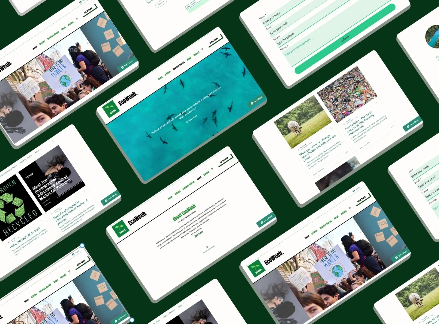
High-fidelity ‘Home’ Wireframe
I imagined the home screen to be the main portal for the user, to encompass the key aspects of the website. The articles just below the slide show and the connectivity to the instagram page followed by a quick sign up at the bottom of the page was purposely designed to create a homogenous ‘ all you could need’ home page, whilst still being able to section them down of separate pages with more information.


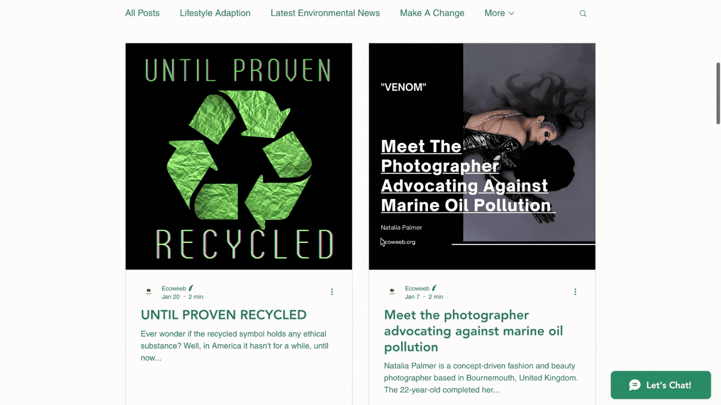
Article layout- Wireframe
After looking through competitors article layouts I knew I wanted to implement a sleeker, more defined segregation of article links. This particular design lays out all the key components necessary for the reader and even includes the interactivity of the comments and like count.
The article layout in action:

Using this particular layout of the article works really well with meeting the goals we set earlier, from creating a good flow, not being cluttered and also being ‘on brand’. You can click anywhere on the article tabs and be directly transported to the desired article.

The Success Story Page
This page was designed with the emphasis of ‘climate success’ that the brand is eager to promote, as there is so much climate angst. At the top of the webpage, I placed a famous quotation by Dr. Sylvia Eagle (which, if you have endured seaspiracy you will know very well) and image slot that matched the theme of the blog to create a soothing introduction to this page and inspire those who visit it.
The article aspect ‘ people who are making a difference’ is designed to showcase the specific articles that are tagged under ‘Climate success’ and will start to look more cohesive as the writers add more content. Again, I wanted to segregate these sections to really emphasise the importance of this category especially aligning with the brand itself and honouring the emphasis on positive action.

Paying Attention To The Finer Details
As the goal of the brand is to educate and help others change their lifestyle, this section is an underdog. Creating quick links to the most vital articles that provide this information directly helps enhance user flow and reduces the time the user spends thinking about which blog to read.
Not to mention, this layout helps get across the most vital information quickly.

As we discovered in the research stage, an about page that clearly demonstrates what the blog is intending to do helps the user connect with the brand further.
For the design of this page, we are going simple. The text is what should be the star of the show and that is exactly what is showcased on this page.

The Contact Page
The contact page should always be clear and concise, capturing the right information for the blog owner and providing enough space and freedom for the user to convey themselves clearly.
Therefore, we have clean input sections that are interactive and simple to use.

When you are using the navigation feature, the page you are on and click on changes colour to show you where you are. This is simply a nice feature to have when you’re exploring new webpages.

Designing For Mobile
As you can see from the images above, the logo has changed. I designed the new logo and you will soon be able to find it in my portfolio!
In terms of adjusting the blog for mobile use, I simply took the same core values which with this project were outlined well and therefore made the transition easier. The main difference is the way you navigate the site itself.
Instead of a navigation tab, which would not make the most sense in terms of usability on a mobile device, unless you have the large phones- we can navigate through the fun menu icon. The menu acts just the same as the navigation bar but is just more accessible for those interacting with the website on their mobile.
Reflection
Prior to the launch of the blog I had a group of 10 individuals use the website and highlight any issues of concern, I suppose you could call this the ‘beta launch’. We worked through some linking issues on the blog that had became jumbled in the development process and I adjusted a few icons to ensure they had a sleek appearance and met the users needs. Initially, we had more of a ‘janky’ navigation tab that did not highlight the page you were on and was certainly more blocky. So, the navigation tab you see above is the updated version. Infact, internal testing happened at every stage of the design process, nothing is great on first draft and therefore communicating every issue, every idea was the centre piece of the project.
Solving pain points:
A recap of the pain points:
-segregating sections
-flow
-creating a stand out brand
I certainly think I tackled all of these aspects, and I did keep reflecting back on these as the project went on so i had the clear goals in mind for the blog.
What went right?
I gained a lot of insight through competitor analysis and through interacting with the sites for hours on end. I then repeated this process with some peers and observed their interactions with the sites. This process really helped me envision what I wanted to implement into this blog and how I can make the experience for the user as pleasurable as possible and even helped me hone down on the design ideas I had.
Points of struggle:
The part I struggled with the most would be developing the blog itself, as I mentioned, this is a 360 role and I did not have a software developer or a coder on the team. Therefore, figuring out how to implement my designs into an actual website was a challenge to begin with. Whilst, I did not code the website, I used a software to help with that.
Improvements?
I still have a few more ideas to implement with this brand, and this main body process is just the beginning. To. ot give too much away, I am working on a community area which will certainly ass to the goals of the blog itself.
In terms of the current design, I would like to have a more clear cut colour pallet with consistent hex codes, and I am looking into proposing this as an option soon.
Thank you for visiting
